23 Dec Visual Knowledge Dimensions
 Visualizing knowledge in graphs and charts empowers decision makers by giving them actionable knowledge in understandable format. To make this most effective, the labels on the graph must provide clearly defined context cues that make it easy to interpret. Converging data strategies using Big Data (Hadoop, NoSQL, Cassandra, MapReduce…) can change the way we access content of almost any digital structure (data records, documents, sound files, movies…) and lead the way to more actionable knowledge. This convergence of data increases the “dimensionality” of the things being reported, and there are times when the graphical depictions must be rendered in three or more dimensions to deliver the expressiveness needed to visualize the meaning of the reported data.
Today I want to explore the meaning and implications of representing and communicating data in multiple dimensions.
| Understanding Context Cross-Reference |
|---|
| Click on these Links to other posts and glossary/bibliography references |
| Prior Post | Next Post |
| Visualizing Knowledge | Visualization Deception |
| Definitions | References |
| decision makers knowledge | Aristotle St. Augustine |
| meaningful facts | Wickens et al (1998) |
| Bayes' Theorem induction | Taylor Protocols CVI |
| learning interpretation | Explorable DataWatch 2014 |
We’ve seen interesting examples of communicating devices that use audio and video in unique ways to deliver information. For intelligent devices in a Transformer movie and an old Disney movie called Flubber, clips of songs and movies become important communication devices. This is not a new literary device. Allusion and reference to broadly known quotes and events from literature have long been a staple of written communication. I am not above doing it in my blog.
Business reports, however, have been focused on facts and transactions in databases with little or no reference to meaningfully related material from other current or dated sources. This narrow focus, I believe, carries an enormous opportunity cost of omitting easily obtainable information that could help human analysts make better decisions. That’s why I have made significant efforts to add images and videos to this blog, as well as frequent references to the work of ancient thinkers such as Aristotle and St. Augustine, who had something worthwhile to say about the human condition. The human condition, after all, is what we care most about, is it not? Roads are not for cars and trucks, electricity is not for appliances and lights and governments are not for laws and taxes: everything we do is to improve the human condition. So why not improve the way we report on everything also?
Human Factors Engineering is driving many important developments in computing, ergonomics and User Experience Design. Google gives me 16 million hits on “human factors engineering” including many scholarly articles. “Introduction to Human Factors Engineering” by Christopher Wickens, et al (1998), describes the physical and mental capabilities and limitations of humans operating computing devices, and how system designers should use better understanding of human behaviors and capabilities to guide the design of hardware and software systems with which people interact. We humans are multi-dimensional beings living in a multi-dimensional universe, so it seems reasonable that we should be able to visualize knowledge in at least three dimensions.
3-D Representations
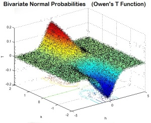
 Once we learn to interpret either the rows and columns of numbers or the graphical depictions, it becomes possible, and sometimes easy to digest the information embodied in them. Part of the promise of automation is to deliver accurate data to make it easier for humans to interpret and make decisions. The shapely image of bivariate normal density in the graph at right has mathematically significant labels enabling those who know the formula to extract useful information from it. Without the formulas, it may lose its usefulness.
With the information depicted in this graph, we can see understand a slice of historical data, and possibly predict that the bulk of future events, or results of the same nature, will fall somewhere within the bell-shaped (or modified bell as shown here) probability space. The two variables interact to affect the probability of an event occurring. The probability is represented in the curve of the diagram. Interpreting the numbers behind the hundreds or thousands of statistical measurements that fed the graph would take too much time and effort for most humans.
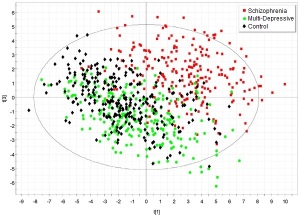
The same statistical density can also be represented using a two-dimensional plot, and any of a number of other graphical forms. Scatter diagrams like the one shown here are very useful forms for dealing with a wide variety statistical data. They can be used either to infer scientific laws or predict characteristics of unknown subjects. The utility of these models in scientific analysis arises from the ability to convert large numbers of data points into clearly visible patterns.
 The scatter diagram at right, if depicted in three dimensions, would look more like a mountain range than the distributed dots shown at right. The biggest peak in the mountain range would be in the lower left quadrant, representing clusters of control group cases and MDD cases with no cases of schizophrenia. It is difficult for people without expertise in the knowledge domain to know what to make of this, but the addition of more expressive labels for the axes, and the addition of unstructured content such as anecdotes, vignettes, analyst comments and possibly sounds, images or video could dramatically increase the value of this report for experts and other interested consumers.
Goals of Statistical Analysis
Statistical analysis of data can be used to answer different types of questions:
- What does the data tell us about the subject(s)?
- What do relationships between the data tell us about the world?
Multivariate statistical analysis can be used to classify information about the subject by showing trends and concentrations. For example, if you live by a river, and you want to predict changes in its level for the spring flood season, you may create models based on accurate readings of ground water, snow levels upstream and historical river levels. You can also apply fuzzy constraints to multiple prediction and multiple regression analysis by applying weighted composites, such as reliable precipitation and temperature forecasts. Multiple regression analyses use models with a single dependent variable and two or more independent or exploratory variables that constrain the output of the model. The variable whose value is to be predicted is known as the dependent variable and the ones whose known values are used for prediction are known independent (exploratory) variables (Explorable).
 If you only want to see the river level, a simple trend-line graph will do. But if you want to see how the model behaves and tweak constraints to see different outcomes, being able to visualize each of the constraints can be very helpful. Two and three-dimensional vectors are intuitively ideal for analyzing performance or status profiles. When fuzzy values are involved, Bayesian techniques are particularly useful. When the dimensions of the problem exceed three, however, intuitive graphical profiles are more difficult to produce because only three dimensions are apparent to the eye at any time. In addition, the required calculations consume great amounts of computer resources. By segregating dimensions and their neighbors, you can effectively flatten out the data and view two or three dimensions at a time. But segregating the data is not always desirable. A less symmetric fuzzy solution may be appropriate, then, for some types of complex analysis.
Questions of the second type (relationships between data) are useful in answering the first type, though many laws of cause and effect are presumed to be universally understood. In fact, the ability to interpret many naturally occurring relationships is considered common sense. The fundamental notion of relationships, however, deserves examination in the context of the science of statistical analysis.
Measurements
Accurate measurement of statistical data is the basic premise for using such data for inductive reasoning. Without accurate measurement, laws and predictions cannot be generated from the data. In psychology and education, test scores are often used as basic “yardsticks” to measure performance. School attendance records can also provide a scale useful in some types of statistical analysis. Scalar indicators or ordinal measurements often describe performance data, whether that performance reflects a single event or the aggregate of many events over time. Intervals and ratios provide good scales for comparing this type of data.
Measurement can also be abstracted from scalar performance to apply numerical values to nonscalar information such as the results of personality questionnaires or vocational interest inventories (Look at the CVI as a good example). These numerical abstractions, or nominal measurements, are not as easy to equate to the real world, but they provide good bases for plotting information in a graphical form that can be used to produce graphical representations of data.
Numerical symbols used to describe non-numerical information are commonly used by digital computers to perform language, graphical, and other types of symbolic processing. Thus the term measurement is applied to the acquisition and use of both scalar and nominal STATUS and PERFORMANCE data.
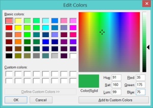
 From a symbolic perspective, there is no real difference between using the word GREEN and using the number 35-175-75 to represent the color of grass. Sure, we recognize the former immediately and we probably do not recognize the latter, but using numerical values to represent STATUS information is just as valid as scientists using Latin words for a common international language that transcends language barriers.
A recent whitepaper from DataWatch suggests that “visualization technologies will soon evolve from being supplementary visual discovery tools for analysts, to becoming core applications that actively steer businesses. They will incorporate a much greater set of capabilities. They will become true platforms for managing data. They will incorporate new algorithms and predictive, analytic capabilities so that business users can not only “see” new discoveries, but intelligently know how to act on those discoveries. For example, R and Python programming capabilities are starting to be integrated into the software to incorporate logic into the visualizations” (DataWatch 2014).
Here is one of the key points I want to bring out today: Transcending language barriers, less symbolic forms of communication, such as images, sounds, aromas and videos, may be better at conveying our messages than words and numbers alone. As we begin to select appropriate methods of delivering understandable, and possibly actionable knowledge, the more dimensions we can add to the package, and the more appropriate the graphical forms we select, the more likely we will be to reach the people we are trying to help. Rich media objects can form additional dimensions that bring greater understanding and context to our audience, reducing the need for long explanations and further clarification.
| Click below to look in each Understanding Context section |
|---|


