


27 Dec Visualization Deception
 The differences between the way computers think about things and the way humans process information can create significant dissonance and opportunities for misunderstanding. Both are in the business of finding answers, but approaches differ. While for humans, things we see with our eyes may be earliest and foremost in our thought process, it is almost always the case that visualization capabilities are an afterthought in a computational system. So we are often forced to become sleuths to find the answers we need. In order to manage the detective work, we often need to mark off the scene by creating a sample space and confining our forensic work to only those things central to finding the answer.
As noted in my sequence of posts on steps in building knowledge apps, gathering the needed knowledge is an important early step.
| Understanding Context Cross-Reference |
|---|
| Click on these Links to other posts and glossary/bibliography references |
| Prior Post | Next Post |
| Visual Knowledge Dimensions | Unhuman Expertise |
| Definitions | References |
| think information processing | Guilford & Fruchter 1978 |
| probability sample space | Visualizing.org NSF Vizzies |
| prediction filtering | Crime Scene DNA evidence |
Knowledge Boundaries: Sample Space and Range
In probability theory, the sample space is the set of data attributes that define the discourse. All possible outcomes of a scalar or nominal measurement of the data constitute the measurement of the sample space. Without probing too deeply into the formulae associated with determining probability, we can safely say that the distribution of cases in the sample space provides a basis for prediction of outcomes dependent on the applicable data.
Range is the scale of distance between the lowest and highest values obtained from a sample distribution. Because range defines the extreme ends of the scale, it may be a marginally deceptive metric compared to central tendency, if too much attention is paid to the fringes. It is useful, however, for segregating phenomena within normal spectra from exceptional or anomalous data. In a filtering system, setting appropriate ranges enables automatic systems to flag out-of-range values, which can be of great value to the analyst.
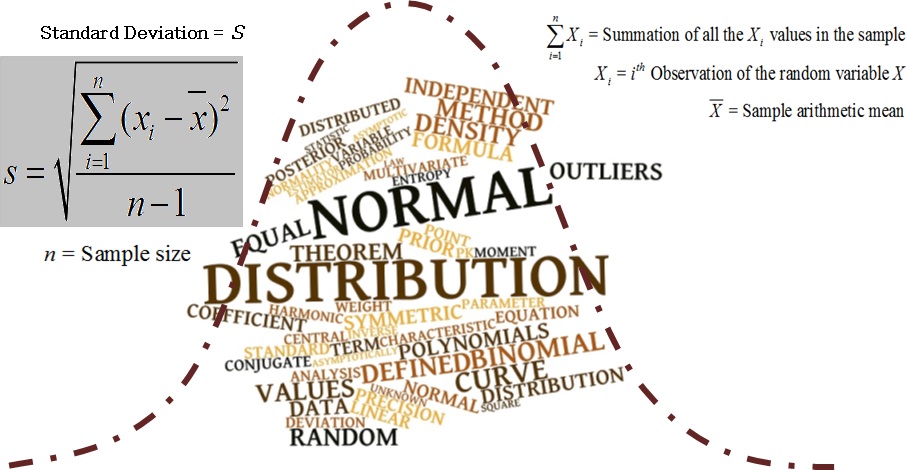
Standard deviation is a formula for measuring the distance of any result from the center of the average result. It is the most commonly used indicator of degree of dispersion and is the most reliable measure for estimating the variability in a population. Standard deviation can be extremely useful in the context of discriminating between normal, exceptional and anomalous cases. The formula for standard deviation is shown in the equation below: the square root of the mean of the squared deviations from the mean of the distribution. This is one of the equations used to derive standard deviation in which N is the number of values and X refers to the values.
The mean deviation is the mean of the absolute values of the distance of all cases from the mean of the distribution. It is less frequently used than the standard deviation, but because it is computationally simpler and yet a fair measure of variability, it can be useful.
Normality vs. Majority
The bell-shaped curve above occurs so often in statistical analyses that it has been dubbed the “normal curve.” This does not necessarily mean that data sets that exhibit different characteristics are abnormal, but dramatically different distribution topologies may signal something worth examining more closely. A key to the name of this post: just because the data looks different than you expect it to, don’t immediately assume you were wrong or the data is wrong. Unexpected outcomes and results are often due to more (or sometimes fewer) constraints than we originally factored into the model. The practical take-aways are:
- Understand your domain thoroughly
- Validate your domain knowledge and behavior assumptions
- Build your model to reflect the right elements of your domain to derive the desired outcome
- Validate your model with as much real data, including outliers, as you reasonably can
 Looking at the picture at right, one might assume that the majority of watercraft that use the sea-lane, there on the shores of Istanbul, are sailboats. Close inspection would show a couple powerboats in the foreground at left and outlines of a large vessel in dock, but the majority in this picture are sailboats participating in a regatta, part of the “Extreme Sailing” series. You may even have guessed that they are racing because they are so close to each other and sailing in the same direction, and that this is an event outside the normal use pattern of this patch of water. But if you knew less about what goes on with boats, you may need some explanation of what you are seeing. Many visualizations of knowledge share this characteristic: people without deep expertise, and some with deep expertise, often need verbal explanations, such as labels or narrative descriptions to correctly interpret the data.
Furthermore, logical fallacies arise from using a snapshot of data to make broad generalizations. Looking for more in the data than is actually there is a downfall of many analyses, especially those intended to come up with quick and dirty answers, or attempting to prove some point. This is a trap that all disciplined seekers of knowledge should avoid by testing and validating the assumptions that go into the conclusions we derive, as well as investigating and remembering the nature and source of the information we are using to draw conclusions. We are better served by behaving like sleuths in search of unknown answers than behaving like salesmen that only seem to care about points that will help close the deal.

False negatives and positives are a problem in any analysis, but in some cases, errors can be devastating. This is especially the case with Crime Scene DNA evidence.
Validating Domain Knowledge Models
Nonparametric (distribution-free) statistical modeling is a good tool for validating domain knowledge and process models. As I mentioned in Measuring Knowledge, Nonparametric (distribution-free) Statistics operate on fewer and less strict assumptions. They, therefore, may be even more useful for fuzzy or irregular data with characteristics such as:
- Distinctly non-normal elements that cannot be transformed
- A sample set too small for the central limit theorem to lead to normality of averages
- A distribution not covered by parametric methods
- Elements from an unknown distribution
- Nominal or ordinal data sets
When a sample is small or the distribution is not normal, non-parametric approaches to analysis can be used to visualize and better understand the domain or model. These are less rigid and provable than other mathematical approaches, but they can be used to rectify skewed distribution. Distributions can be skewed by errors in measurement procedures or devices, or by human error in recording values. When situations like this arise, some arbitrary means of normalizing or relaxing statistical distributions can add to the flexibility of analytic techniques (Guilford & Fruchter, 1978, p.212).
 In knowledge-based computing, nonparametric techniques are often necessary in the early stages of knowledge acquisition and correlation. When an intelligent system is required to make inferences against a deficient knowledge domain, these techniques are invaluable in fine-tuning automated learning and in supporting supervised learning where humans analyze and tweak until the system gets it right. If everything in the real world fit neatly into the “normal curve,” our job as expert system designers would be easy: get the data and squeeze it in. Curiously, normality is rare. Regularity is uncommon. Weird is the rule, not the exception. This is especially true in language and the resolution of ambiguity, and in most other problems with which we have to grapple. Consequently, we are best served by having multiple tools with which to display data.
Graphical Problems
Graphical approaches and their mathematical infrastructure are clearly good and useful, performing essential roles in the business world. They do, however, have limitations. Before racing to plug these kind of features into our expert systems, we need to look for gaps or weaknesses in current approaches and suggest remedies. Rather than attempting to replace current techniques, this discussion seeks to accomplish different objectives that current techniques may be inappropriate for addressing. Visualizing.org creates interesting opportunities to tackle vexing visualization challenges as does the National Science Foundation in its Vizzies competitions .
The usefulness of graphic representations in aiding human analysts does not transfer to computers. AI-based systems designed to imitate human analysts have a major disadvantage: no eyes. Computers can be more than clumsy when it comes to image analysis. In fact, they are much more efficient in dealing with the columns of numbers that we first abstracted into those interesting g raphics. Consequently, the formulae used to convert the raw data into the intermediate data of means, modes, deviations and probabilities are still necessary for the AI-inference techniques. The more complex formulae for generating the graphs need not be a central part of a computerized induction engine.
Another weakness hinted at earlier is the limited number of scales that can be incorporated into a single graph. Not only are the scales limited in number, but they must generally contain similar or closely related types of data. It can be very difficult, for example, to integrate ordinal, ratio and interval data into a single graph. The addition of nominal measurements can be even more complex. Yet, surely these different types of data interact in meaningful ways that could assist the analyst.
| Click below to look in each Understanding Context section |
|---|
SHARE THIS ARTICLE


