17 Dec Visualizing Knowledge
Visualizing Knowledge – Automatic Generation
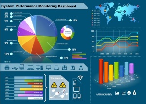 Words are so symbolic that even symbolic thinkers, like me, understand more when there’s a picture to go along with the words. is partly explains my crazy use of images in this blog. The various forms of graphical representations are superb inventions that enable us to view and understand mathematical data that, in a typical spreadsheet, would be opaque or downright unfriendly. Today, in order to survive in the highly competitive software market, analytical tools and spreadsheets include advanced graphics generators to convert rows and columns of ciphers into visually appealing and meaningful representations. With these images, decision makers are able to digest huge amounts of information at arbitrary levels of detail in almost no time at all.
Some of the more advanced tools such as Tableau, SiSense, and Evolita include different levels of knowledge modeling. My inbox is frequently brimming with information about such tools. Today it was TechTarget with a Data Warehouse updating handbook. The Big Data trend is disruptive because it can deliver performance and scale with converged structured and unstructured information. Once semantic technologies rise in maturity and implementation ease, another sea change (gradual but profound evolution – as opposed to C-Change that occurs once in a century) will create new opportunities for organizations to get not only scale and performance, but actionable knowledge to boot.
| Understanding Context Cross-Reference |
|---|
| Click on these Links to other posts and glossary/bibliography references |
|
|
|
| Prior Post | Next Post |
| Measuring Knowledge | Visual Knowledge Dimensions |
| Definitions | References |
| symbolic understanding | gradual sea change Duda 1973 |
| CPU Framework | TechTarget |
| linear discrimination algorithms | Goddard Earth Science |
 When I originally began writing this content in the late 1980s and early 1990s, there were several popular spreadsheet programs: Lotus 123 (recently retired), Excel and Borland’s (now Corel’s) Quattro Pro come to mind. Before that I had used Ashton Tate’s Framework III suite of apps. These were each amazing in their time (and Framework still is), but, of course, aggressive marketing won the day and Excel has dominated this space for the past decade. But the multi-dimensional analytics or Business Intelligence (BI) tool space is much more vibrant and competitive. Even with amazingly powerful tools, however, there is a huge manual component. One of my sons and one of my sons-in-law earn their livings providing the manual component behind knowledge visualization.
In order to automatically generate these graphic forms out of tables of statistics, a suite of mathematical formulae are available as discussed in my post on Measuring Knowledge. Although they consume tremendous amounts of computational energy, we don’t see that because the speed of modern CPUs makes it instantaneous. We may take the speed for granted even though we have not long had such computing power at our fingertips. The results of these formulas and algorithms are extremely accurate, provable, and useful as aids to analysts. In “Pattern Classification and Scene Analysis”, Richard Duda and Peter Hart (1973) describe useful mathematical models for description, discrimination, classification, and decision making based on the scientific laws that can be inferred from careful observation and accurate assembly of salient statistics.
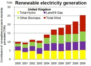 Stacked bar graphs are good for comparing the components of numbers over time. In this illustration of renewable energy in the UK the red wind and biomass contributions grow steadily while the hydroelectric (yellow) remains more stable.
All the charts in this post show what can be done automatically in a spreadsheet. If we know what the pie is comparing (apples or orangutans), we can learn much in a quick glance. There are other cases in which trend-lines are better, such as when you are trying to predict the future performance of a thing that is likely to continue past behavior (though it is possible that very few things in the world stick to yesterday’s script).
Picturing Mathematical Reasoning
Mathematical processes can be used to generate graphic depictions of data that aid users in inferring scientific laws. The eyeball is a tool that humans have long used very effectively to learn about the world. Translating symbolic information such as numbers into graphic representations that enable us to use one of the most powerful tools at our disposal can be an extremely useful analytical process.
The columns of numbers below show how inaccessible some information can be. If, instead of reams of pages of numbers, we presented a layman like a government legislator who controls educational purse strings with a graph that depicted the columns of numerical statistics on intelligence, he would probably find the numbers more meaningful. The newspaper USA TODAY began years ago using iconographic charts to show information in a user-friendly way.
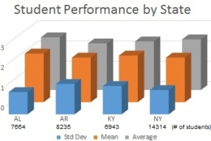 Grade 6: standard scores in selected states
State, Students, Mean, Average, Std Dev
AL,7664,2.4,2.6,1.1
AR,8235,2.2,2.3,1.5
KY,6943,2.3,2.4,1.4
NY,14314,2.2,2.5,1.2
The symbolic organization of the information above is marginally understandable if we perform some complex symbolic reasoning. If, on the other hand, we depict the information in a graph, it becomes much easier to grasp and compare. If this makes 16 data points easier to understand, consider more complex analyses.
- Ross Perot knew that he could reach people by showing them graphs during his presidential bid in the 1992 U.S. general election. At a minimum, the time and energy required to digest the full impact of the data decreases dramatically when users are presented with information in visual, graphic forms that make sense.
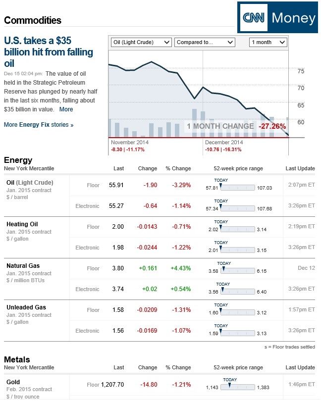
CNN Money reporting on today’s oil prices, which are falling due to increased production in North America and OPEC decisions not to limit production, are shown very graphically in the following report. The two-dimensional trend-line graph is augmented by single-dimension “range” rulers showing metrics valuable to commodities traders. I am not a trader, and I don’t understand the implications behind “Floor” and “Electronic” trading numbers, but I understand what this report shows and extract useful knowledge.
Shady Areas
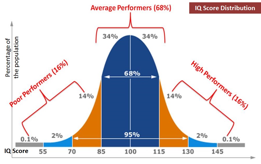
The graph below deals with a single variable: Intelligence Quotient (IQ). All the cases involved in this study fall in the colored area of the graph. If we used average IQs as the Y axis, and created separate graphs to represent different ages, demographics or geographies of subjects, then, by plotting individual cases in the appropriate places on the grid, it would be easy to tell whether the subjects’ results were consistent or anomalous for the age group geography or demographic slice represented. By introducing another variable, we increase the expressive quality of the analysis, but risk straining the capacity of two-dimensional representations. By ensuring that our averages are based on large enough samples to infer reliability, this form of representation can be an extremely useful tool in analyzing data and inductively learning about general samples and specific examples.
The utility of this graphical form of representation is tied very closely to the human eye. By exploiting the convenient geometric form of a matrix and the strengths of our ability to visualize information, a powerful combination is born. And pie charts appeal to both the eye and the taste buds … or not.
Complex Graphs
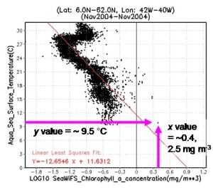 Scatter diagrams like this are particularly useful for looking at distributions of things that share a classification but have different characteristics. They are preferred by many practitioners because, in addition to providing very accurate descriptions of the distribution of data, the number of dots indicates the size of the sample used. This form is also appealing in that it is computationally less demanding: only two dimensions are represented. Nonetheless, each form of representation has its place in the toolbox of the analyst, and most data sets are best represented in more than one form.
What does this mean? The bell curve, about which much has been written in the current literature on child learning, may be familiar to many readers, but the meaning of the scatter diagram is probably less apparent. For a good discussion, look at the Goddard Earth Science site where I found this diagram.
Let’s assume that each quadrant represents a characteristic of a computer program. By plotting programs based on characteristics like this, it becomes quickly apparent which programs are prime candidates for replacement or upgrade and which are still useful for the business, or, as in the case of Gartner Magic Quadrants, which are the most innovative and stable and which are up and coming.
In all these examples of visualizing knowledge, we see that by creating meaningful visual representations of symbolic information, and by labeling the axes or dimensions expressively, much information can be delivered quickly to support rapid human analysis and decision making. No matter how smart machines get at interpreting symbolic data, the ability to support human analysis and decision making will remain central to a system’s usefulness and acceptance. Visualizing knowledge in graphs and charts empowers decision makers with actionable knowledge in understandable format provided a clearly defined context. In upcoming posts, I will describe how converging data strategies using Big Data (Hadoop, NoSQL, Cassandra, MapReduce…) can change the way we access content (bigger than data) and lead the way to more actionable knowledge.
| Click below to look in each Understanding Context section |
|---|


